How to Choose the Perfect Wedding Invitation Color for Your Theme
Share
1. Match Your Wedding Season
- Spring Weddings: Choose soft, romantic tones like Blush Pink, Sage Green, or Ivory. Pair with Rose Gold Foil for warmth and softness.
- Summer Weddings: Go vibrant with Red, White, or Emerald Green, and complement with Gold Foil for brightness.
- Fall Weddings: Deep hues like Burgundy, Dark Green, or Gray feel grounded and seasonal—especially with Gold or Rose Gold Foil.
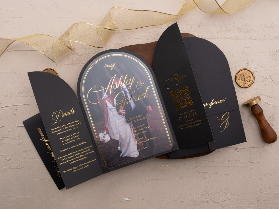
- Winter Weddings: Elevate drama with Black, Navy Blue, or Purple, paired with Silver Foil for crisp, cool elegance.
✨ 2. Choose a Foil Color That Complements
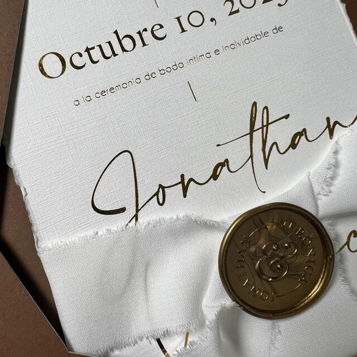
- Gold Foil – Best for warm, classic, and luxurious themes
- Silver Foil – Modern, minimalist, and sleek
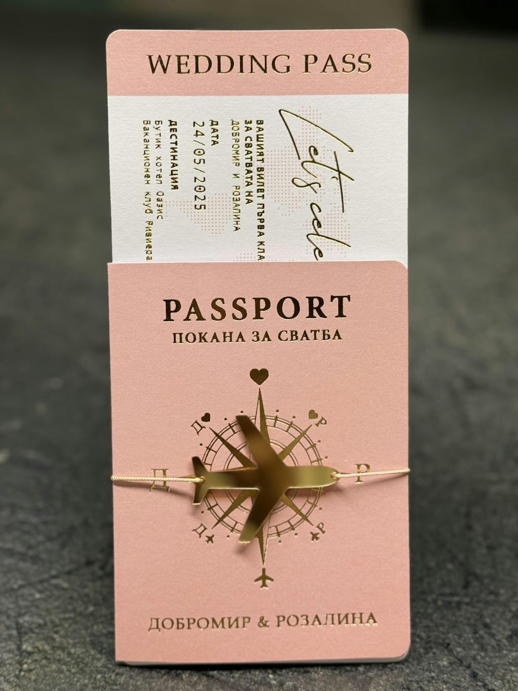
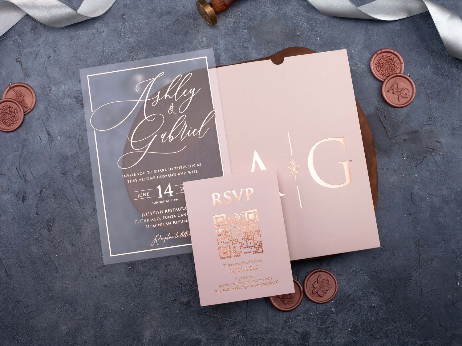
- Rose Gold Foil – Romantic, unique, and stylish
Each foil changes how the color base feels—gold adds richness, silver adds clarity, and rose gold adds charm.
📐 3. Think About the Venue and Dress Code
A black and gold invitation fits a formal ballroom wedding. A sage green and rose gold combo suits a garden or vineyard. A navy and silver design is perfect for coastal or winter weddings. Let your venue guide your palette.
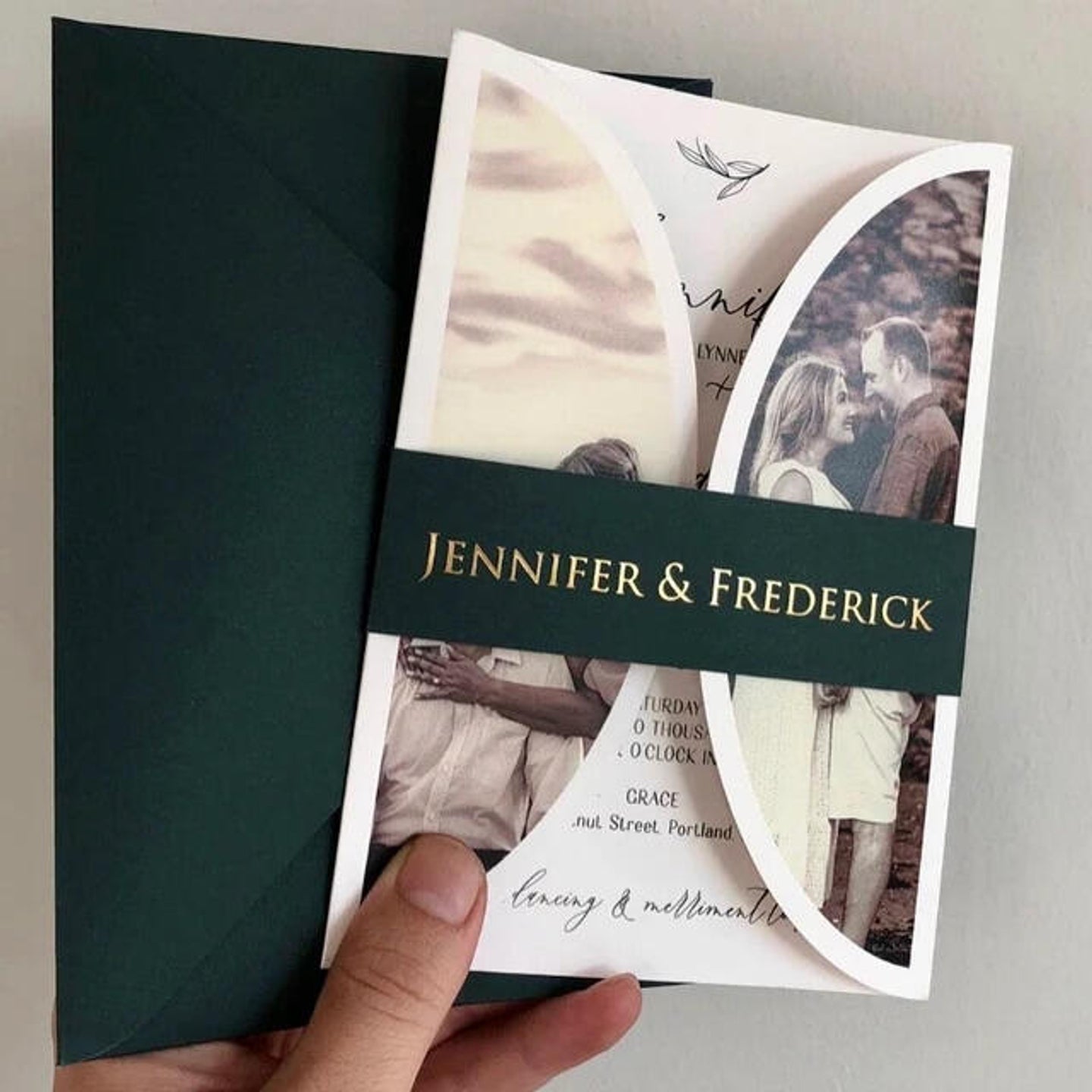
🛍️ 4. View Real Samples in Our Arched Foil Collection
Browse 12 unique color options in our signature arched format—every one customizable with any foil. Whether you want something modern or timeless, bold or understated, you’ll find your match in our curated lineup.
👉 Explore the full Arched Foil Collection here
✅ Final Tip: Order Early
Foil printing is precise and specialty-driven. Be sure to order at least 6-8 weeks before your mailing date, especially if you plan to customize further.